Wednesday, March 4, 2020

Week Seven

3/3/20


After Jimmy and I finished our Sugar Bowl layouts over the weekend, on Tuesday in class we had a group critique. We traded pieces with another group and went up to the front to comment on each other's work. Jimmy wasn't in class, so another student and I presented our thoughts on Clara and Ian's layout. 

Our overall comments were on the lack of consistency between the two versions. Because there were two people working on the two parts keeping the layout, typefaces, body text can be challenging. Another part we commented on was the repeating of the logo and the name "Sugar Bowl" at the top. We felt that only the logo would have been sufficient enough.   

The first two are Clara's main page and menu for mobile. 


The main issue about the mobile design is the movement of the drop-down hamburger option. Because it is nestled into the type and then moves when the menu is open, it may be confusing if that is apart of the design. Another comment is on the spelling mistakes such as "Available" and "Mushrooms" and minor inconsistencies in leading. An element that does work well in the layout is the hierarchy in the menu.

The next two are Ian's main page and menu for the web.


To start, we addressed that the layout size is incorrect for a webpage and that it appears to be the same size as the mobile. We appreciated the thinking of using the colors for the social media icons since we were limited to only 3 photos/icons, but they create a disconnect to the rest of the page. Similar to the mobile menu there is a strong hierarchy in the listing if items and the prices clearly match up to the item. However, the columns are very close together and not consistent with the rest of the spacing on the page.

We then switched positions and Ian and Clara commented on Jimmy and my layout.

For Jimmy's web design, they commented that the layout worked well and the information breaks apart nicely. 

For my mobile design, they commented that the layout worked well and enjoyed the addition of the cart/basket options. 

The negatives encompassed both the web and mobile with the colors being too high-end for the Sugar Bowl, we relied on boxes too much and the numbers/hours could have been bolded. As a class, they commented on changing the colors and of the "Lancaster" and "Millserville" labels because they may get confused with the headers.

Overall I agree with all the suggestions and comments shared and I will definitely think of them for future designs. 


_____________________________________________________________________

3/5/20 - Virtual Class

I started by completing the readings of the notes on web typefaces and then I began to code. I got stuck a few times on trying to have things work, but then I realized that I didn't have the correct file open. 

Here are the screenshots of the file code and how it looks on a pc.


Tuesday, February 25, 2020

Week Six

2/25/20

Over the weekend I edited my typeface after the notes form the class on my critique and uploaded an edited version in the OneDive. 


I removed the small tail in the "p" and "q" so they wouldn't overlap the other characters. I noticed while editing the "p" and "q" increased the height of the lowercase "f" because it was shorter than the other characters.

We started working on fixing SugarBowl's website with my partner. We made a mood board on Pinterest (https://pin.it/5XzubzD) deciding the colors and potential layout.

We then chose a decorative type (Modak) and a body type (Istok Web) and designed a style tile together to use for our designs.

Color Inspiration


With a clear decided direction, outside of class, we can both begin to work on the designs.

_________________________________________________________________________


2/27/20

After working outside of class, Jimmy and I continued to work on our layouts together. Working next to each other made it a lot easier to bounce ideas off one another and make sure our design was consistent and agreed upon. Sadly we had to change our primary typeface (Modak) to something with a thinner stroke so it would be easier to read. We found a typeface called Spicy Rice to use instead. 

Bellow is my final mobile layout with a home page and then the menu. The page is long since it is to be scrollable on a mobile device. The menu has a dropdown menu feature when you select an item you can add it to your bag. 


Tuesday, February 18, 2020

Week Five

2/18/20


After sketching and editing on paper and the computer, I finally finalized my typeface! The typeface is called Bumblebee and has been uploaded to Fontself for the web.


https://m.fontself.com/otX2JevVb4 

After completing our typefaces, we were assigned our next project of redesigning the 
Sugar Bowl's website (http://www.sugarbowl.biz for the web and phone. I will be 
redesigning the phone layout while my partner Jimmy (https://jblanck244.blogspot.com/) will 
be redesigning the web layout. We first began by working on choosing a color palette 
and some ideas for a layout. We both agreed on warm colors similar to what the sugar 
bowl currently has, but not has bright. 

We looked at some examples of websites that worked and one that we both enjoyed the 

layout of is a more fancy restaurant called Amorette (https://amorette.com) that used photographs as a way to section the website. We have a restriction of only using
three photos for the website so we will have to alter the platform slightly since we have 
fewer photos.

___________________________________________________________________________

2/20/20

We began class by gathering together and critiquing our typefaces. Mostly all of the typefaces
were decorative, but of all the students in my class, I was the only one who created a script 
style type. I was commended on being able to create the type to be able to flow together and
connect like cursive. I was happy when the student presenting mine connected the style of the
characters to the cursive letter tracing done as a child. Some comments I received were there
was still some disconnect in the lowercase letters connecting especially with the "m" because 
of the flare at the end of the last hump. I am going to tweak some of the letters over the 
weekend and update the otf file. 

After our critique our class went to a talk at the Adams house to learn about trademarks and
copywriting. The presenter went into great detail on how filing for ownership of an idea, item,
slogan etc can be done and what is protected. I enjoyed how the audience was able to ask 
questions throughout the presentation. 

My partner Jimmy and I continued to work on sketching out our ideas for the Sugar Bowl
website. Below are two rough sketches I have for the home screen and the menu for a 
mobile device. 


Home

Menu
I will need to rework my sketches with my partner to find something we both agree on. The 
biggest change I will have to do is limit the icons and photos. We can only have three 
icons/photos on the site so I will have to rely on typography. 

Thursday, February 13, 2020

Week Four

2/11/20 

The next step in creating our typeface layout, after creating the final sketches on graph paper, is to scan them into the computer and image trace them in Illustrator to vectorize them.

Over last weekend I took photos of my drawings and opened them in Illustrator. I then image traced the page and then copied each letter over to a different file to position them. This step of the process was long and tedious since each letter had to be adjusted to fit the x-height and descender/ascender lengths.


During class on Tuesday, I continued to clean up my spacings and sizes my descender/ascender lengths pass the size of the artboard, but my professor reassured me that I should be okay as long as the lengths are consistent. 


Descender

Ascender


Towards the end of class, I began to question the quality of my image trace. My characters are comprised of small marks so they can be traced, but they were hand-drawn so they are not consistent in length and weight. I began to explore going through and replacing all the marks with a drawn line on Illustrator so the glyphs were more consistent throughout. 


Original Image Traced

Attempt With Using a Consistent Line


I started liking the consistency and more clean style, but then they began to look more boxy and flat in certain parts. I decided to revert to my original idea and keep the hand-drawn consistencies because the typeface is meant to be hand traced so it should stay handmade.  

_________________________________________________________________________

2/13/20

After editing my typeface I began to open them in Fontself Maker in Illustrator. I knew that some characters would need to be adjusted with baseline and kerning, but as I was typing I realized there was a large disconnect between the flow from character to character. Because the typeface is to imitate cursive I would like them to lead into one other and not need to be adjusted heavily by the user. 


The problem was primarily in the lowercase characters since they need to flow into one another more than the uppercase character do with the rest of the word. To adjust the difference in spacing I created a guideline roughly halfway through the characters to create consistent connections between each letter.


Tuesday, February 4, 2020

Week Three

2/4/20

Our next assignment is to design our own typeface that will then be used in a digital way rather than printing. I originally wanted to digitize my handwriting, but I am not sure how I would use that as a digital project at the end. I began to think beyond that one idea into different concepts that I could use. I had three main ideas I wanted to explore further. 

  1. Cursive Tracing - can type out sentences and have kids digitally trace out the letters.
  2. Block Stacking - child block style that can be stacked.
  3. 3D - create some depth on the screen ???
Below are some sketches I did of the three concepts I thought of. 


I decided to focus on the cursive idea since I feel the most passionate about the reasoning behind the typeface and I think I can turn it into a digital project as well.

I started to work on the characters with the lowercase letters first. After talking to my professor and working out some sizes I finalized an x-height and the maximum size of the descenders and ascenders. I then began doing some sketches of the characters trying to keep the counters and lengths consistent and the dot spacing even.  


We also received feedback from our professor on the typeface layouts we completed last week. I tried my best to keep the layouts consistent between the different platforms, but I can see after speaking to my professor that there are some things that should have been adjusted. I changed based on her suggestions and created the layouts to be more uniform.

Web 1024 x 768px


Phone 750 x 1334px

Film 1280  x 70 px


_____________________________________________________________________________

2/6/20

As a class, we went to the Eckert art gallery to see an interactive projection art exhibition by Genetic Moo. They are a London duo inspired by an ecosystem documentary to code worlds for their micro creations. The exhibition was interesting primarily because it was all created through code and was made to be interactive with the viewer. 

Below are the final sketches for my cursive typeface. I have all the letters from Aa to Zz and numbers 1 to 0. Over the weekend I am going to begin to vectorize my sketches through Illustrator.      


Thursday, January 30, 2020

Week Two

1/28/20

After presenting our typeface cube project we began our next project of type classification layouts. For this assignment, we are to take two contrasting classifications of type and collect some research on them and layout that information in 3 different forms: phone, web, and film. I chose formal and casual as my two different typefaces and began collecting reach on them as seen in the screenshot below. 


The highlighted text is the information I used for my three different layouts. 

Below are the three final layouts for the two type classifications. The fonts and colors are consistent so they can be recognized across different platforms despite the info being slightly rearranged to fit the size restraints of the page.  


Web 1024 x 768px

Phone 750 x 1334px

Film 1280 x 70px
_______________________________________________________________________

1/30/20 - Virtual Class

From the readings, one thing I learned that I found interesting was the development of fonts designed for the web. The research into digitally creating characters/glyphs only began in 1968 and by the late 1970s a digital type was created that could replace old-metal type. I have understood the differences in certain typefaces and what can easily be read at different sizes or the amount of spacing it needs, but only through this class recently did I learn more about how specific type is meant for screens and others are used for print. I understand more why there is a difference between screen type and printed type especially with now knowing that certain code is needed to allow a font or typeface to be printed. 


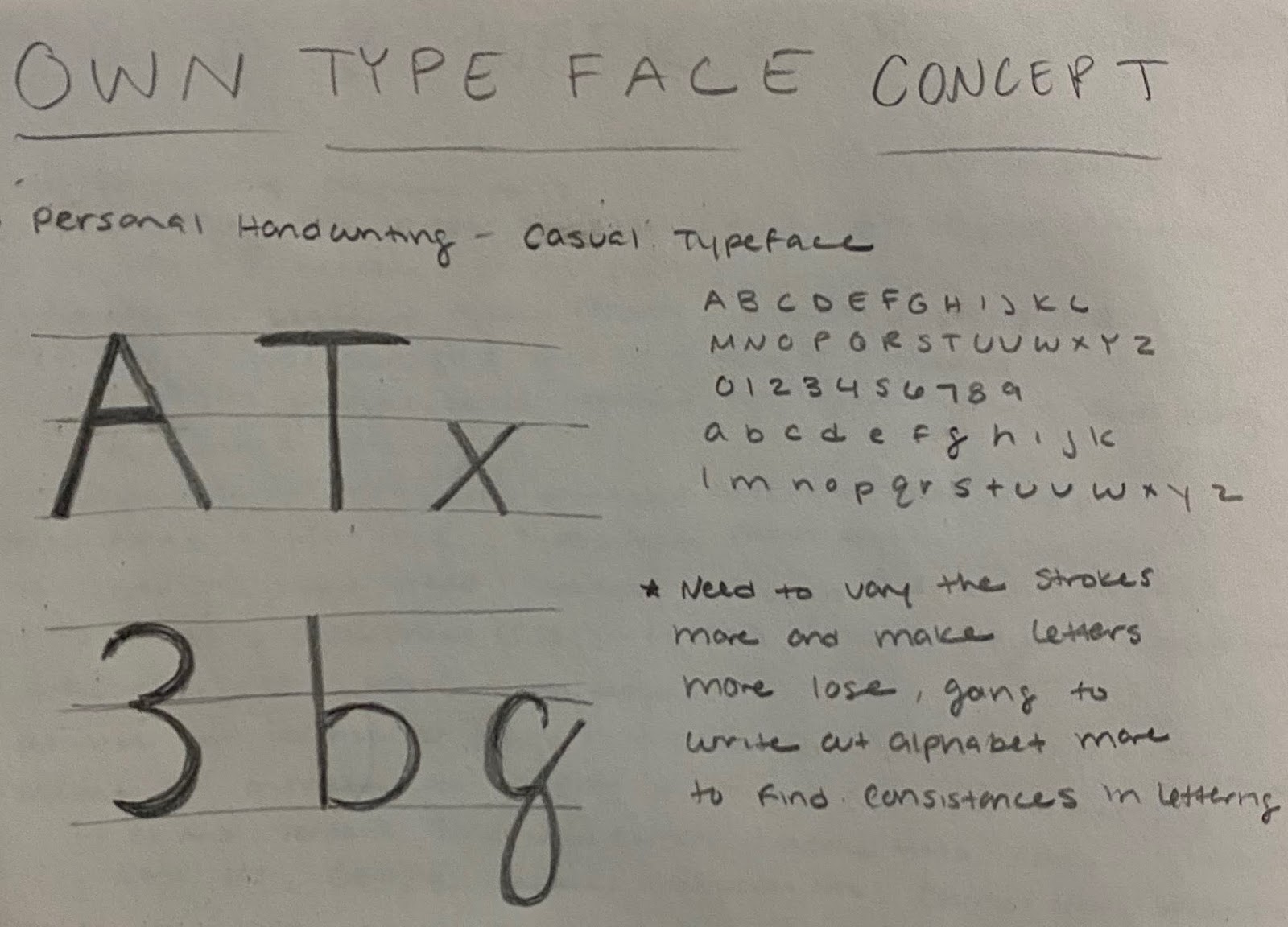
For my first typeface sketch I wanted to explore my handwriting as a potential idea. I enjoy the softness of my quick lettering and the roundness of my letters. When I tried to sketch larger I began to straighten my strokes and even out their weight which isn’t what I am aiming for. If I chose to continue this concept I am going to write out more letters and compare their similarities to each other and do more research into handwritten and casual typefaces. 


Thursday, January 23, 2020

Week One

1/21/20

Today we began our project on researching a typeface and designing it around a three-dimensional cube. I chose Futura a sans-serif typeface that has many different fonts and has a unique history to it. The objective of our project is to share the history of a typeface in a 3D form.
___________________________________________________________________

1/21/20

After finalizing my research and creating my mockup I went to Illustrator and began to work on designing my typeface cube. Below is my research, sketches, and original mockup for my design. I printed out a blank cube and after writing on the cube where the text should go I re-flattened the cube to see where I would have to position the type on Illustrator.


I then began to work on laying out the cube in Illustrator using Futura and it's different fonts and styles to create emphasis on different words in the sentences. Below is the final design layout on Illustrator with the final printed out mockup.


Over the weekend I printed and folded the final design to a 6 x 6 inch cube.


Pannel 1


Pannel 2


Pannel 3


Pannel 4


Pannel 5


Pannel 6


Links to researched sources:

https://www.mentalfloss.com/article/78962/stories-behind-10-famous-typefaces-and-where-theyre-used
https://www.sessions.edu/notes-on-design/type-in-history-futura/
https://eyeondesign.aiga.org/happy-90th-birthday-to-futura-the-modernist-typeface-that-is-literally-everywhere/

Week Sixteen

5/5/20 Today I met Professor Mata through zoom for an in-progress critique. She gave a lot of helpful feedback with my design and the l...