Thursday, May 7, 2020

Week Sixteen

5/5/20

Today I met Professor Mata through zoom for an in-progress critique. She gave a lot of helpful feedback with my design and the layout.
  • Add a screen recorded video of a word or name being traced out (screenshot and use the iPad).
  • Include about information on the typeface
  • Add links to other pages or elements
  • Include photos
_______________________________________________________________________

5/8/20

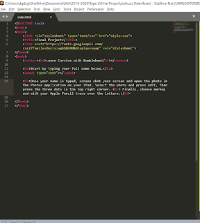
The final week for my final project. I finished my digital design using my typeface Bumbleebee. I ended up implementing some of her feedback Professor Mata suggested into my final design with the video and added information. Below I have two screenshots of the final page and photos of the code. 


Saturday, May 2, 2020

Week Fifteen

I began working on my final project using my typeface. My idea is to create a page for the iPad to type in your name and then screenshot and practice tracing. I used HTML and CSS and worked through trying to create the page. I'm not sure how I feel about the background, but the page is working as I was envisioning. I have to find out how to open the document on my iPad and how I am going to present the idea. 


Tuesday, April 21, 2020

Week Fourteen

4/21/20

Today we presented our manifestos in small groups for critiques. Below are screenshots of the manifesto that I presented to my groupmates.


I received a lot of positive comments on my manifesto and some feedback on an adjustment to make. The positive comments I received are:

  • The overlap of "I believe..." on the green boxes works to create some depth
  • The bolding of the main parts of the text creates emphasis of the main points
  • The manifesto is created in my style which works well since they are my personal declarations
  • The contrast between the organic heading and the computer blocky body type connects well with graphic design and the leaves
The adjustment that Professor Mata suggested is to add some more padding with between the boxes in the half-size and phone size because they are a little tight. I am going to make those adjustments and repost the changes here and in OneDrive.

I adjusted the padding for the middle and smaller size. Below are screenshots of my final manifesto and of my code.


___________________________________________________________________________

4/23/20

For my final project using my typeface, I want to create something connecting to my original idea of the typeface being used as a way to type out sentences or names to help people learn cursive. My idea is between either an animation of a word or a letter being traced out sort of like a tutorial video to show the flow of writing each character. I would use After Effects for the animation. My other idea is to make a page that a user can type out something and then use a stylus or Apple Pencil to trace over. I'm leaning towards the Apple Penical tracing idea, and if I go with the tracing idea, I'm not sure of the best way to present my idea. Do I take a video of me tracing some of the words? And what words should I use? I'm open to suggestions and ideas on which direction to go.


Thursday, April 16, 2020

Week Thirteen

Over the past week, I have started working on my manifesto. The last exercise we did on making responsive text with "gallery-x" was really helpful so when I began my manifesto I started with the code of that assignment and began to rework it. Below are screenshots of my manifesto so far in 3 different sizes and the code. 


I am happy with the direction I am going, but I know I can elevate the design more and there are some coding items that need to be adjusted. I was able to zoom my professor for a one-on-one in-progress critique for some help. Below is a list of the comments she suggested.

  • Change the ... to ellipses not periods
  • In the paragraphs explore bolding some words that convey the main points
  • Change the ' in I'm and add some padding so it stays on the edge of the green box
  • Explore using a script typeface for the heading (organic contrast)
  • Make the green blocks all the same length
  • Add a quote to the top
  • Lighten the background (change opacity) so it is not competing for focus
All of her comments were extremely helpful and over the weekend I am going to work on implementing those suggestions.  


Sunday, April 5, 2020

Week Twelve


Exercise Six (in week eight)

________________________________________________________________________

Exercise Seven


Exercise seven was a reading on building a web library for our manifesto assignment. Below are the answer to the questions from the exercise. 

Two typefaces I would like to use for my website are Source Code Pro and Open Sans. Source Code Pro is a typeface I use for a lot of my personal branding projects (such as websites and business cards) because I find it a unique mix between a sans serif typeface with some elongated flares such as in the lowercase i and lowercase l. I chose Open Sans to complement Source Code Pro with its clean simplistic legibility and kerning. 


1. Source Code Pro - monospaced sans serif


2. Open Sans - humanist sans-serif


My favorite display typeface would be a typeface classified under handwriting. A typeface I have used before (that I hope isn't overused) is Permanent Marker. The typeface is in all caps and very bold, and resembles writing with a sharpie or marker. I tend to write with markers in all caps so I enjoy this typeface because it resembles an aspect of my handwriting. 


I'm not sure if Permanent Marker matches the two other typefaces above, but I would have to explore that in my sketches.

_________________________________________________________________________

Exercise Eight

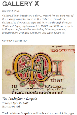
Our next exercise was focused on learning how to make a responsive layout with given text and images. This exercise took me a while to complete because of all of the different percentages and sizes that needed to be adjusted. In the end, I am happy with the result of the layouts.
 Here are screenshots of the three different window sizes.


Medium


Large

Small


Wednesday, April 1, 2020

Week Eleven

After watching the video on minimalist design for the web. I began thinking about a layout for my manifesto.

First, over break, I finalized my writings for my manifesto. I wrote small paragraphs on three different topics, but all focused on art and design. 

The power of creativity 
I believe in the power of creativity. The importance of the use of our imaginations and ideas. Our imaginations reach beyond reality when we allow ourselves to think. When we remove the restraints, we put on ourselves, we can then explore beyond our first ideas and beyond what others are capable of. With our minds open we can make artwork without the judgment of ourselves. Our art and creativity may be judged and critiqued by others but when we inspire ourselves and are proud of our own work, our creativity soars.

The importance of art (community/culture) 
I believe in the power of art. The power art has stood through time, through cultures, through generations. The connections, the symbolism, the monumental moments captured through creation, the history and fame, and talent all are poured into creating art. Art brings people together. It becomes society’s collective memory. As artists, we add to the collection of creations all captivating a moment in times. Not all art is monumental, high in value, or collectively desired, but all art holds a strong purpose to the artist. 


Why I want to be a graphic designer 
I am committed to becoming a part of the creation of items for a visual world. I feel inspired by the designs I see each day through packaging, advertisementsand branding campaigns. To me, graphic design is an effective art form. It’s a way of visual communication and problem-solvingI hope to create designs that are balanced, creative, and effective 

I started by creating a mix of inspiration on Pinterest. I needed an idea of a direction to go with my sketches. 


In my sketchbook, I made three possible layouts shown below. 


Adobe Summit Videos

1. Creating Advertising Impact With Connected Customer Experiences
I was intrigued by the title of this session with the development of making advertisements more of an experience for the viewer. The majority of this video was about Adobe's product Ad Cloud that allows brands to compare analytics of advertisements across multiple platforms and make adjusts to their ad campaigns to best reach their customers. During the session, the speakers focused on the new approach Rite Aid is making to reach their customers. I have seen Rite Aids newspaper inserts so many times, but in this session, they addressed their switch in taking their print budget and putting that money into digital ads to better reach their customers. I have grown to understand the power and importance of advertisements to branding and sales, however, I wasn't aware of the different approaches advertisers take with the different platforms, such as tv compared to social media, and the research that goes into making advertisements that create sales.

2. Discover What's Next With Adobe Sneaks
This was the most interesting session I watched because it was a compilation of seven new software ideas that could be introduced to Adobe. All seven of them were very creative and useful, but there was one in particular that stood out to me that I would love to use myself called Dually Noted. It's an app where you can interact with physical documents and take notes with them in AR and they become virtual. The example they showed was a person in California with a book and another person in New York with the digital pdf of the book. The person with the hardcopy of the book used an app that identified specific parts that he was able to annotate on. Through the app, the annotations appeared on the points in the pdf version. I think this would be extremely helpful for academic work too for students to share annotations of specific parts of a reading assignment with other students.

3. Making Everyday Moments Personal, Every Experience Shoppable 
This video was similar to the first one I watched about user/consumer experience, however, it also addressed the current situation our world faces and brands can adapt to that. The biggest takeaway from this session was the push for personalization. Brands need to grow to the consumer with the expectations of availability, being up to date and holding the attention of the user. I realized that even though there are two sides to advertising: the brand and the consumer, even those that are apart of the brand are consumers themselves and are still swayed by other brands. We all are driven by consumption and advertisements even those to push branding and teach marketing. It was an interesting realization for me to see how personalized this market is. 

Tuesday, March 10, 2020

Week Eight

3/10/20

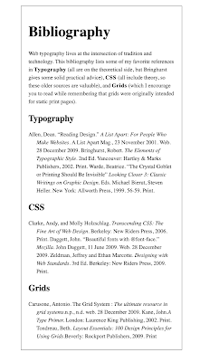
During class, we completed another coding exercise. This exercise was to continue our knowledge of creating a hierarchy of type using size, weight, placement, effect. We coded a bibliography using divs, em tags, and classes to format the type on the screen.


3/12/20

During class we shared our manifesto ideas and completed two exercises. 

First is my list of manifestos. 


  1. The power of creativity 
  1. I believe in the power of creativity. The importance of the use of our imaginations and ideas. Our imaginations reach beyond reality when we allow ourselves to think, to create. When we remove the restraints, we put on ourselves we can explore beyond our first answer and beyond what others can think... 
  1. The importance of art (community/culture) 
  1. I believe in the power of art. The power art has to stand through time and through cultures through generations. The connections, the symbolism, the monumental moments captured through creation, the history and fame, and talent poured into creating art. Art brings people together. It becomes society’s collective memory. As we as artists add the repertoire...  
  1. Design faux pas (list) 
  1. Why I want to be a graphic designer 
  1. I am committed to becoming a part of the creation of items for a visual world. A world where we absorb thousands and thousands of visuals each day... 
  1. The importance of designing for a visual world 

The ideas in green are the ones I was leaning more towards that I briefly expanded on. I was thinking of taking one idea and writing 3 to 4 paragraphs on the one topic, but after our professor showed previous student examples I think I could combine a few of my ideas into on over-all theme of creativity.

Next I completed the building-blocks coding exercise. We continued practicing writing html and css with divs, classing, and padding. 


The the second exercise I completed was editing our bibliography exercise by adding a web font through Font Squirrel. 


Week Sixteen

5/5/20 Today I met Professor Mata through zoom for an in-progress critique. She gave a lot of helpful feedback with my design and the l...