Tuesday, March 10, 2020

Week Eight

3/10/20

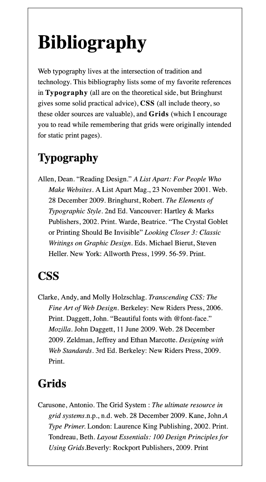
During class, we completed another coding exercise. This exercise was to continue our knowledge of creating a hierarchy of type using size, weight, placement, effect. We coded a bibliography using divs, em tags, and classes to format the type on the screen.


3/12/20

During class we shared our manifesto ideas and completed two exercises. 

First is my list of manifestos. 


  1. The power of creativity 
  1. I believe in the power of creativity. The importance of the use of our imaginations and ideas. Our imaginations reach beyond reality when we allow ourselves to think, to create. When we remove the restraints, we put on ourselves we can explore beyond our first answer and beyond what others can think... 
  1. The importance of art (community/culture) 
  1. I believe in the power of art. The power art has to stand through time and through cultures through generations. The connections, the symbolism, the monumental moments captured through creation, the history and fame, and talent poured into creating art. Art brings people together. It becomes society’s collective memory. As we as artists add the repertoire...  
  1. Design faux pas (list) 
  1. Why I want to be a graphic designer 
  1. I am committed to becoming a part of the creation of items for a visual world. A world where we absorb thousands and thousands of visuals each day... 
  1. The importance of designing for a visual world 

The ideas in green are the ones I was leaning more towards that I briefly expanded on. I was thinking of taking one idea and writing 3 to 4 paragraphs on the one topic, but after our professor showed previous student examples I think I could combine a few of my ideas into on over-all theme of creativity.

Next I completed the building-blocks coding exercise. We continued practicing writing html and css with divs, classing, and padding. 


The the second exercise I completed was editing our bibliography exercise by adding a web font through Font Squirrel. 


Wednesday, March 4, 2020

Week Seven

3/3/20


After Jimmy and I finished our Sugar Bowl layouts over the weekend, on Tuesday in class we had a group critique. We traded pieces with another group and went up to the front to comment on each other's work. Jimmy wasn't in class, so another student and I presented our thoughts on Clara and Ian's layout. 

Our overall comments were on the lack of consistency between the two versions. Because there were two people working on the two parts keeping the layout, typefaces, body text can be challenging. Another part we commented on was the repeating of the logo and the name "Sugar Bowl" at the top. We felt that only the logo would have been sufficient enough.   

The first two are Clara's main page and menu for mobile. 


The main issue about the mobile design is the movement of the drop-down hamburger option. Because it is nestled into the type and then moves when the menu is open, it may be confusing if that is apart of the design. Another comment is on the spelling mistakes such as "Available" and "Mushrooms" and minor inconsistencies in leading. An element that does work well in the layout is the hierarchy in the menu.

The next two are Ian's main page and menu for the web.


To start, we addressed that the layout size is incorrect for a webpage and that it appears to be the same size as the mobile. We appreciated the thinking of using the colors for the social media icons since we were limited to only 3 photos/icons, but they create a disconnect to the rest of the page. Similar to the mobile menu there is a strong hierarchy in the listing if items and the prices clearly match up to the item. However, the columns are very close together and not consistent with the rest of the spacing on the page.

We then switched positions and Ian and Clara commented on Jimmy and my layout.

For Jimmy's web design, they commented that the layout worked well and the information breaks apart nicely. 

For my mobile design, they commented that the layout worked well and enjoyed the addition of the cart/basket options. 

The negatives encompassed both the web and mobile with the colors being too high-end for the Sugar Bowl, we relied on boxes too much and the numbers/hours could have been bolded. As a class, they commented on changing the colors and of the "Lancaster" and "Millserville" labels because they may get confused with the headers.

Overall I agree with all the suggestions and comments shared and I will definitely think of them for future designs. 


_____________________________________________________________________

3/5/20 - Virtual Class

I started by completing the readings of the notes on web typefaces and then I began to code. I got stuck a few times on trying to have things work, but then I realized that I didn't have the correct file open. 

Here are the screenshots of the file code and how it looks on a pc.


Week Sixteen

5/5/20 Today I met Professor Mata through zoom for an in-progress critique. She gave a lot of helpful feedback with my design and the l...