Thursday, January 30, 2020

Week Two

1/28/20

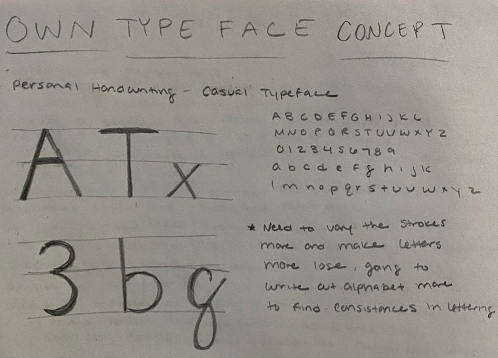
After presenting our typeface cube project we began our next project of type classification layouts. For this assignment, we are to take two contrasting classifications of type and collect some research on them and layout that information in 3 different forms: phone, web, and film. I chose formal and casual as my two different typefaces and began collecting reach on them as seen in the screenshot below. 


The highlighted text is the information I used for my three different layouts. 

Below are the three final layouts for the two type classifications. The fonts and colors are consistent so they can be recognized across different platforms despite the info being slightly rearranged to fit the size restraints of the page.  


Web 1024 x 768px

Phone 750 x 1334px

Film 1280 x 70px
_______________________________________________________________________

1/30/20 - Virtual Class

From the readings, one thing I learned that I found interesting was the development of fonts designed for the web. The research into digitally creating characters/glyphs only began in 1968 and by the late 1970s a digital type was created that could replace old-metal type. I have understood the differences in certain typefaces and what can easily be read at different sizes or the amount of spacing it needs, but only through this class recently did I learn more about how specific type is meant for screens and others are used for print. I understand more why there is a difference between screen type and printed type especially with now knowing that certain code is needed to allow a font or typeface to be printed. 


For my first typeface sketch I wanted to explore my handwriting as a potential idea. I enjoy the softness of my quick lettering and the roundness of my letters. When I tried to sketch larger I began to straighten my strokes and even out their weight which isn’t what I am aiming for. If I chose to continue this concept I am going to write out more letters and compare their similarities to each other and do more research into handwritten and casual typefaces. 


Thursday, January 23, 2020

Week One

1/21/20

Today we began our project on researching a typeface and designing it around a three-dimensional cube. I chose Futura a sans-serif typeface that has many different fonts and has a unique history to it. The objective of our project is to share the history of a typeface in a 3D form.
___________________________________________________________________

1/21/20

After finalizing my research and creating my mockup I went to Illustrator and began to work on designing my typeface cube. Below is my research, sketches, and original mockup for my design. I printed out a blank cube and after writing on the cube where the text should go I re-flattened the cube to see where I would have to position the type on Illustrator.


I then began to work on laying out the cube in Illustrator using Futura and it's different fonts and styles to create emphasis on different words in the sentences. Below is the final design layout on Illustrator with the final printed out mockup.


Over the weekend I printed and folded the final design to a 6 x 6 inch cube.


Pannel 1


Pannel 2


Pannel 3


Pannel 4


Pannel 5


Pannel 6


Links to researched sources:

https://www.mentalfloss.com/article/78962/stories-behind-10-famous-typefaces-and-where-theyre-used
https://www.sessions.edu/notes-on-design/type-in-history-futura/
https://eyeondesign.aiga.org/happy-90th-birthday-to-futura-the-modernist-typeface-that-is-literally-everywhere/

Week Sixteen

5/5/20 Today I met Professor Mata through zoom for an in-progress critique. She gave a lot of helpful feedback with my design and the l...